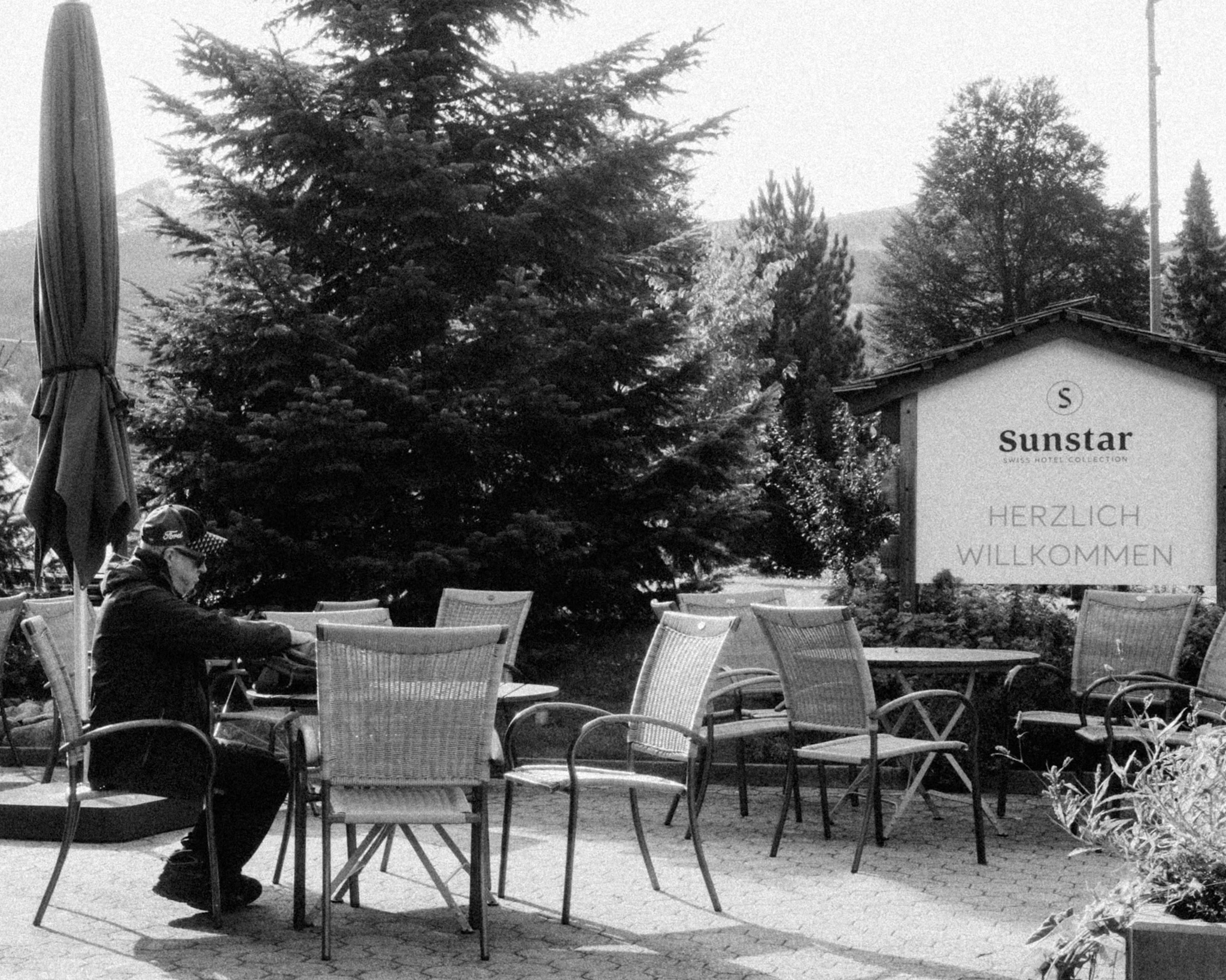
晴れた日の森林公園。青い空に、雲が少し。

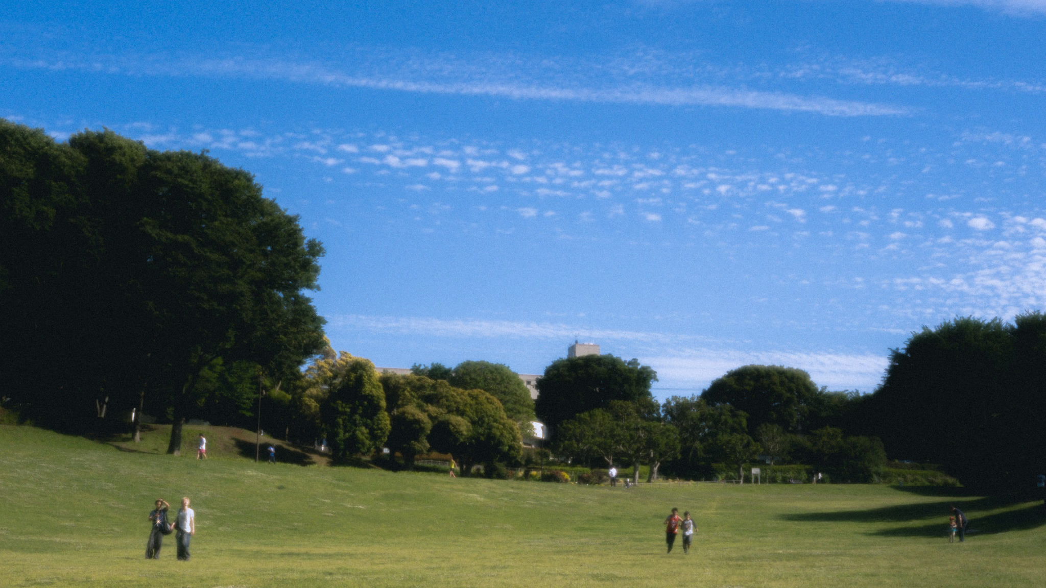

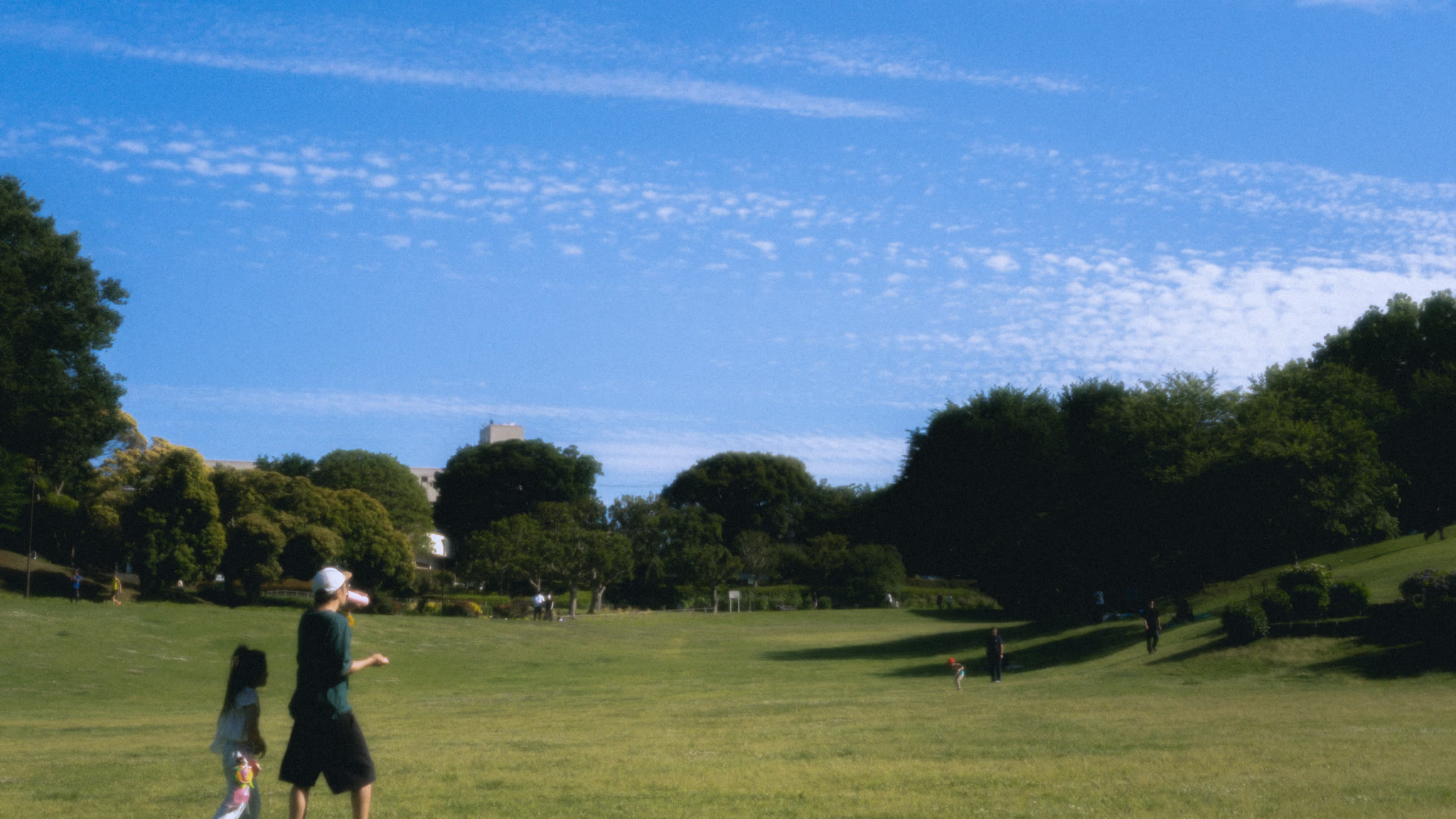

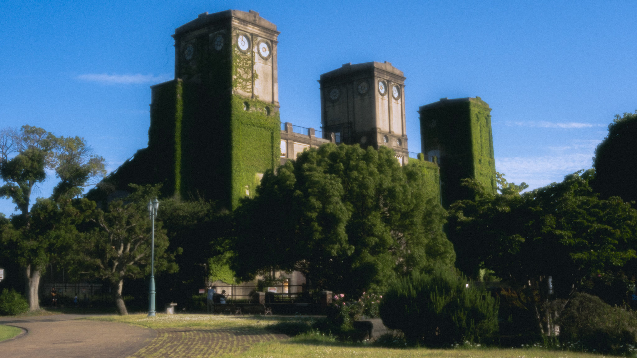

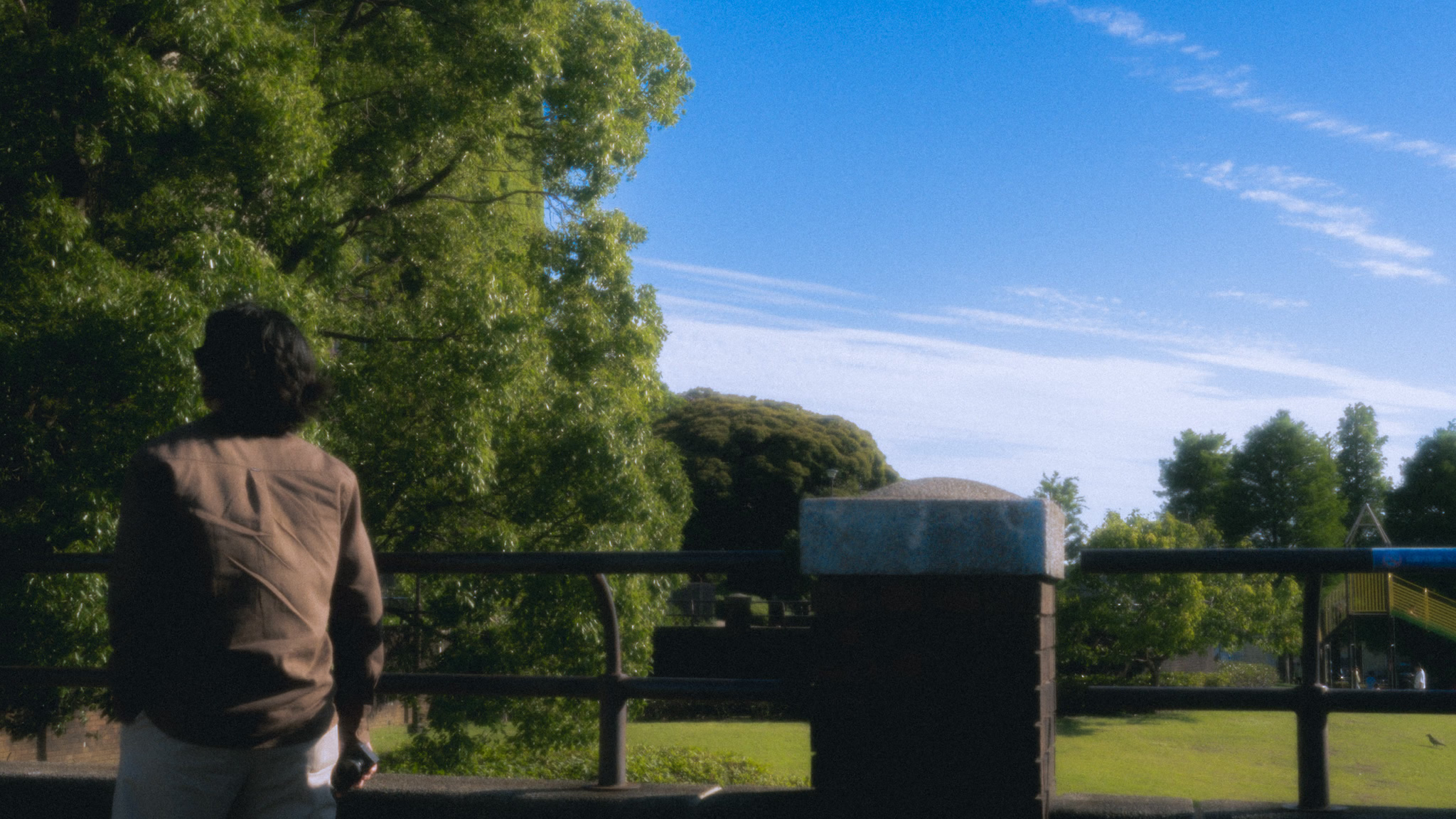
ジョギングをする人。犬と散歩する人。ピクニックをする人。楽しそうに遊ぶ子どもたち。そして、遠くでカラスが鳴いていました。
晴れた日の森林公園。青い空に、雲が少し。
ジョギングをする人。犬と散歩する人。ピクニックをする人。楽しそうに遊ぶ子どもたち。そして、遠くでカラスが鳴いていました。
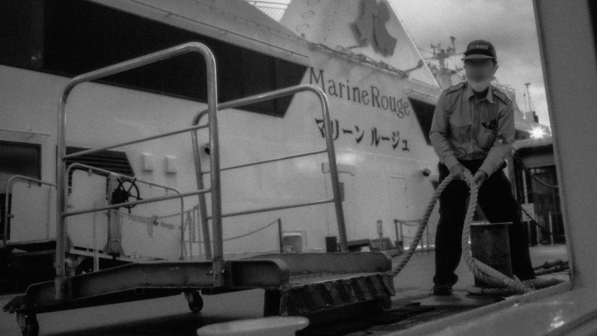
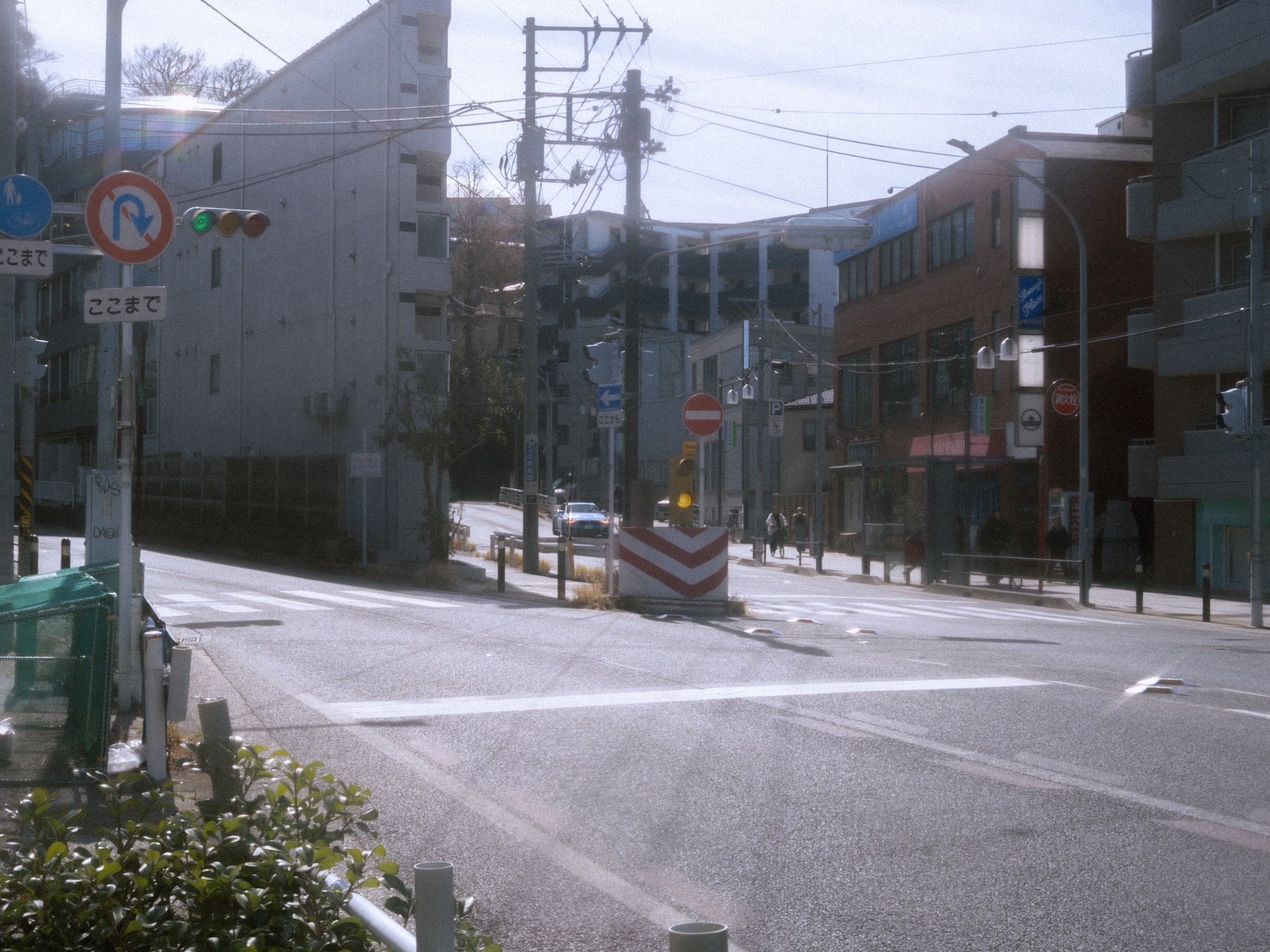
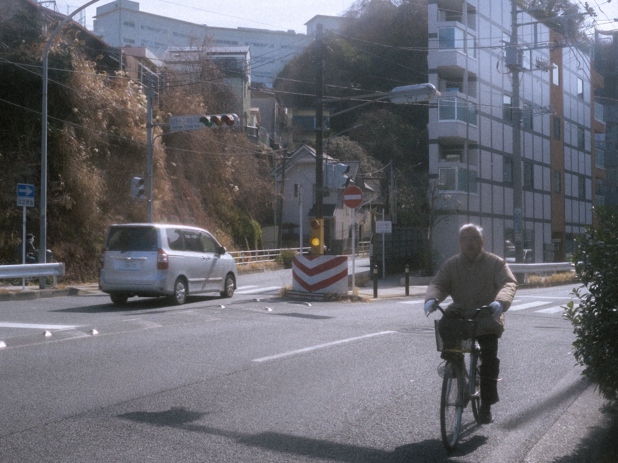
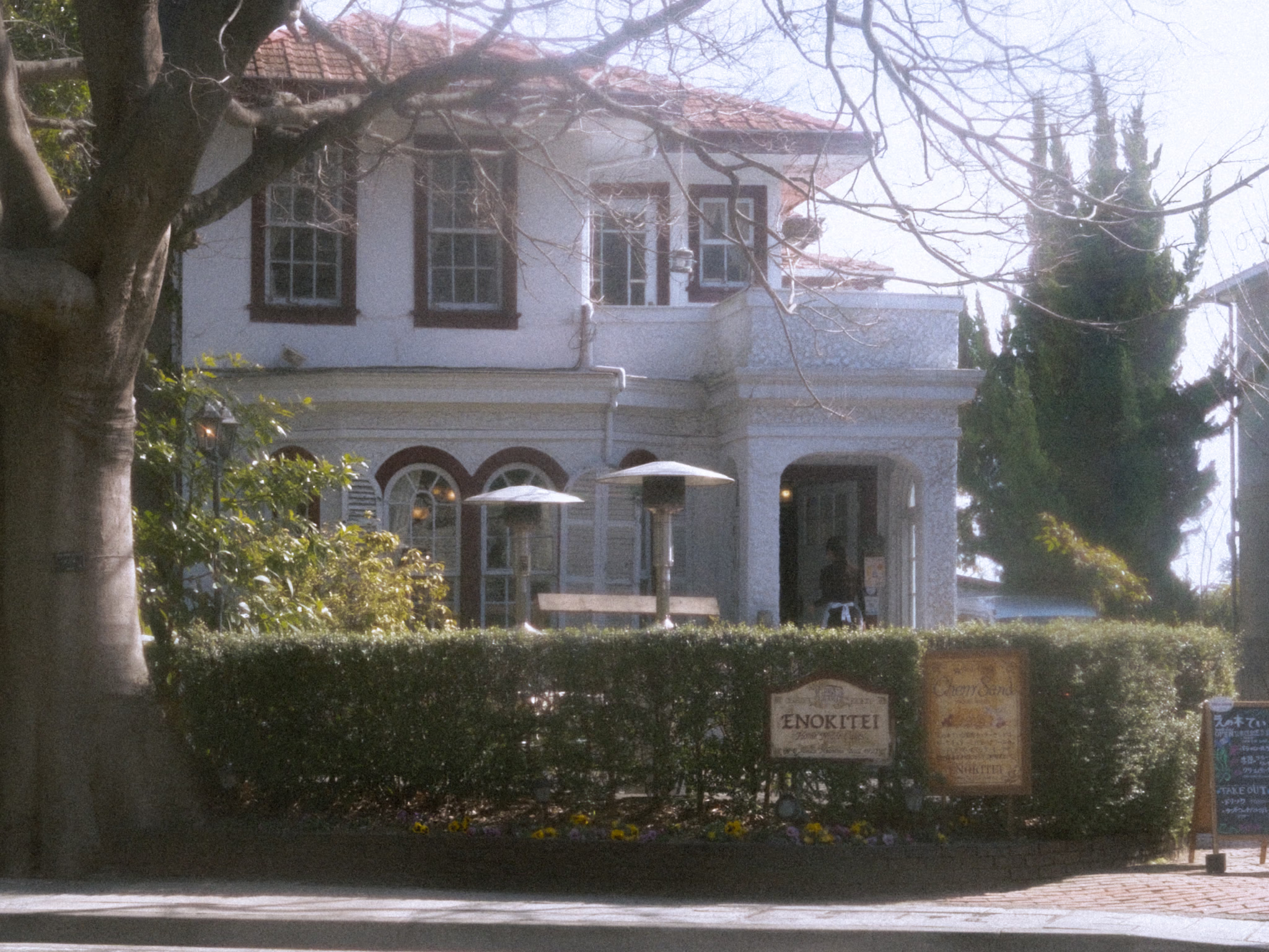
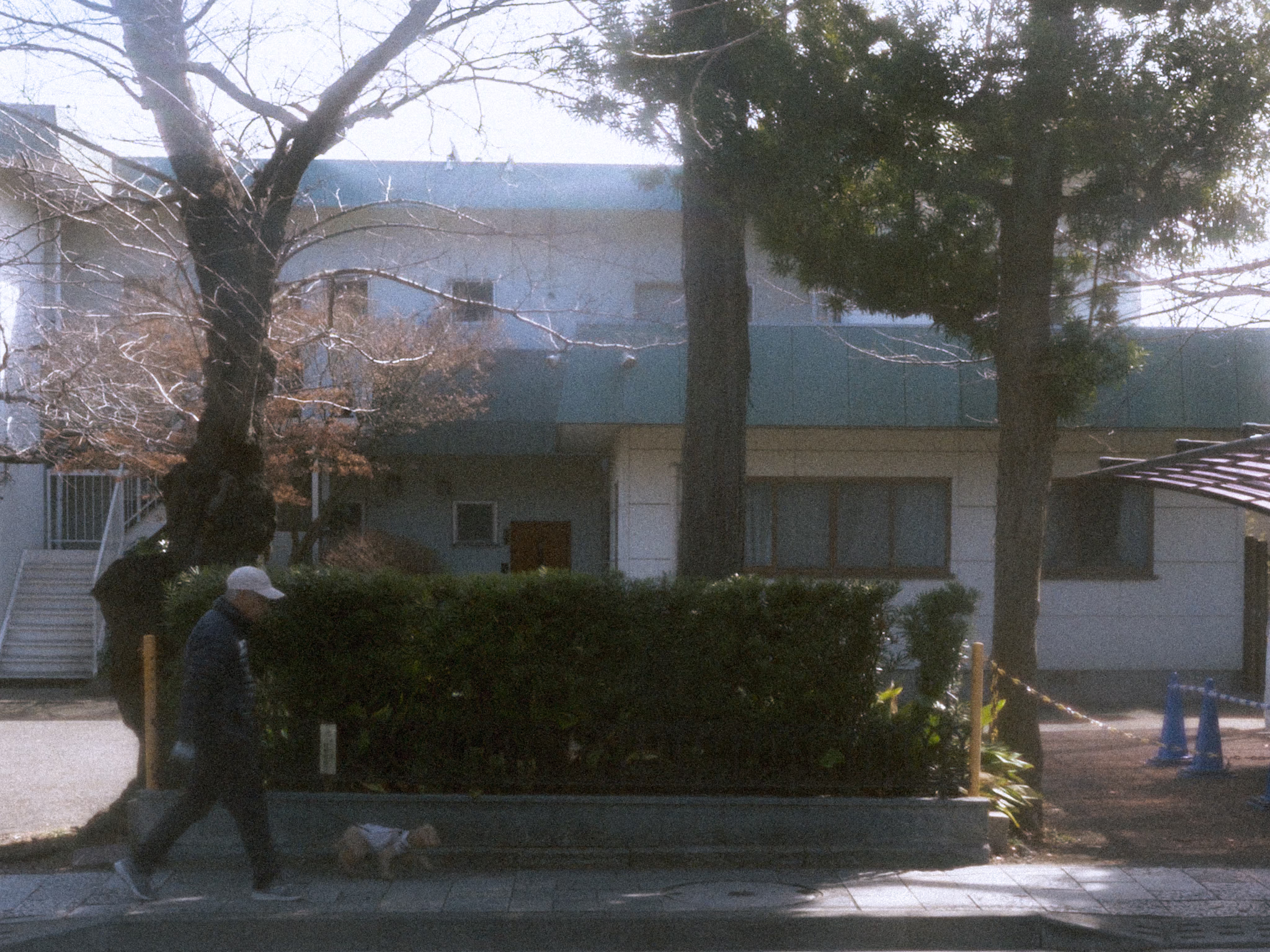
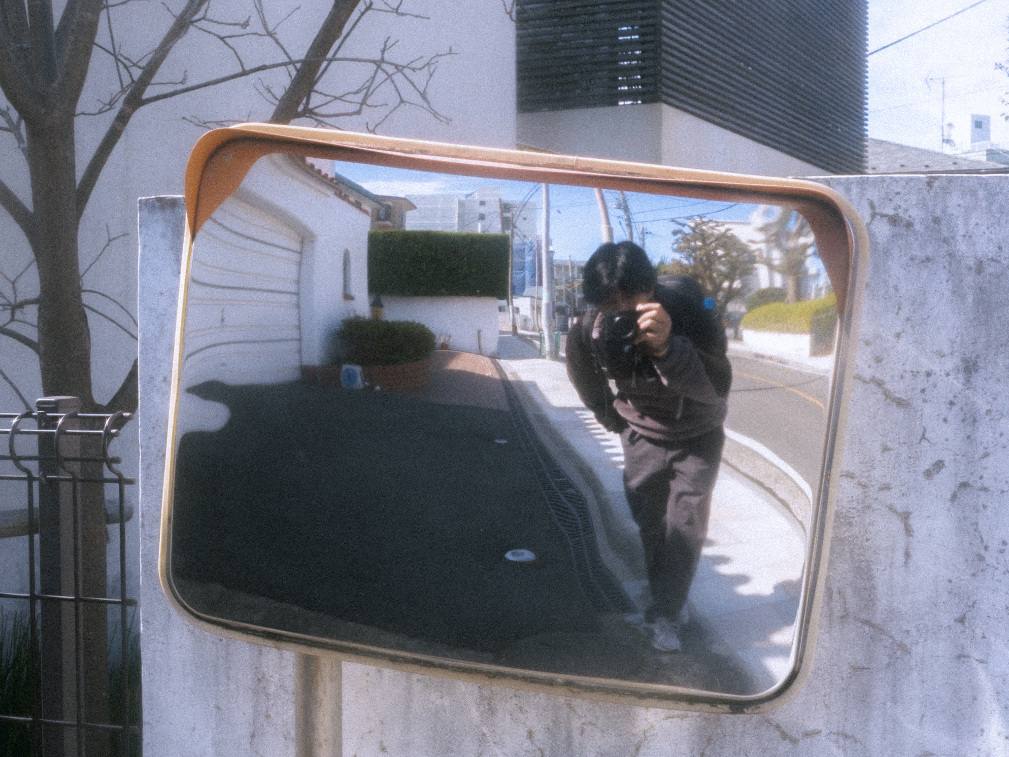
These places aren’t landmarks—not even spots people would photograph. But I visit them every time I’m in Yokohama. I discovered them through two beautiful songs I heard in middle school—songs with music videos set in these exact places.
I remember the first time I visited—I put on my headphones, played both songs, and just stood there for some time—lost in nostalgia until the songs ended. Then I realized I was standing in beautiful places because of those songs—places I once only knew from a screen. I don’t have a word for what this is. People might call it manifestation—something I don’t believe in. Whatever it is… it is—at least to me—sentimental!
Now, every time I visit, even without playing the songs, I still find myself standing there and letting the memories find their way back.
It’s always sentimental Yamatecho.
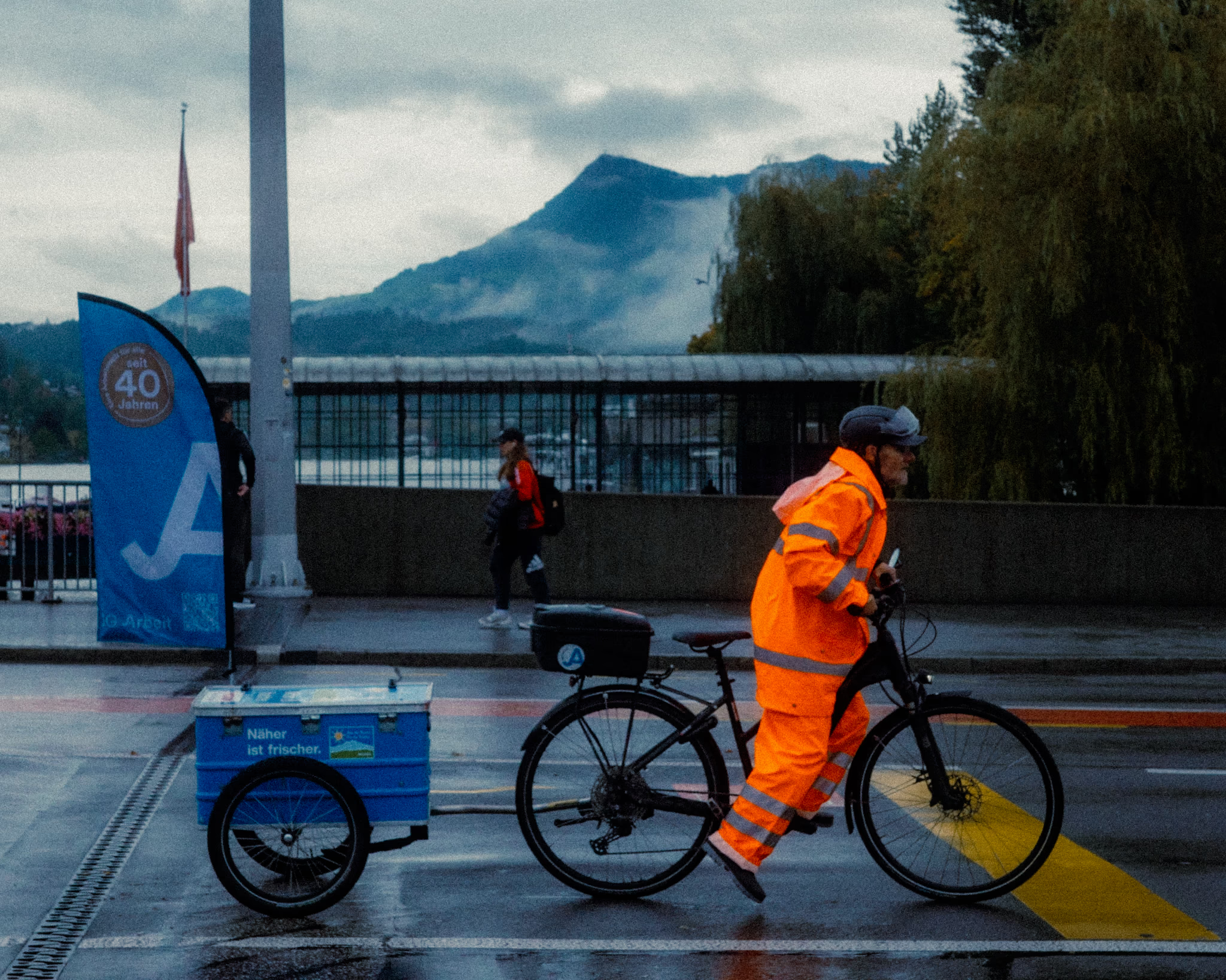
I’ve always liked the look of vintage photography—the kind that mostly comes from film cameras—the texture… the colors… the look I’ve been trying to recreate lately. I did a similar exploration before with VSCO, but now I use Adobe Lightroom.
It’s not easy yet. I still don’t grasp much about color editing. But I’m sure this sense sharpens with more practice—and feeding myself more references!
Then I made my first three vintage presets.
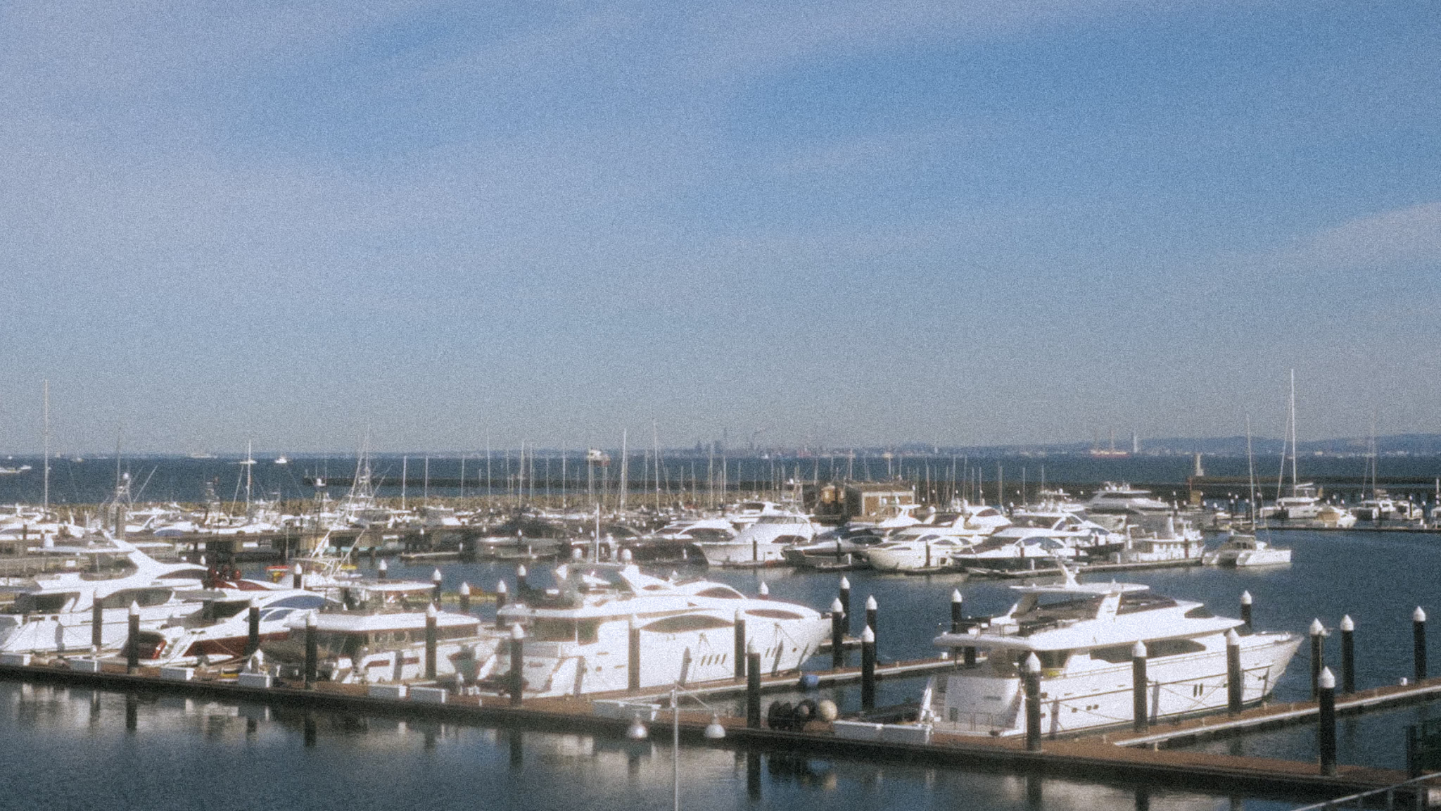
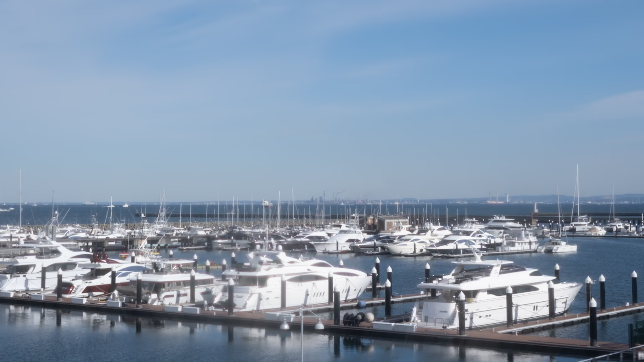
The first one is too yellowish—dull and washed out. But I’ll keep it and improve it. I feel like it could work for photos that need a warm nostalgic feel.
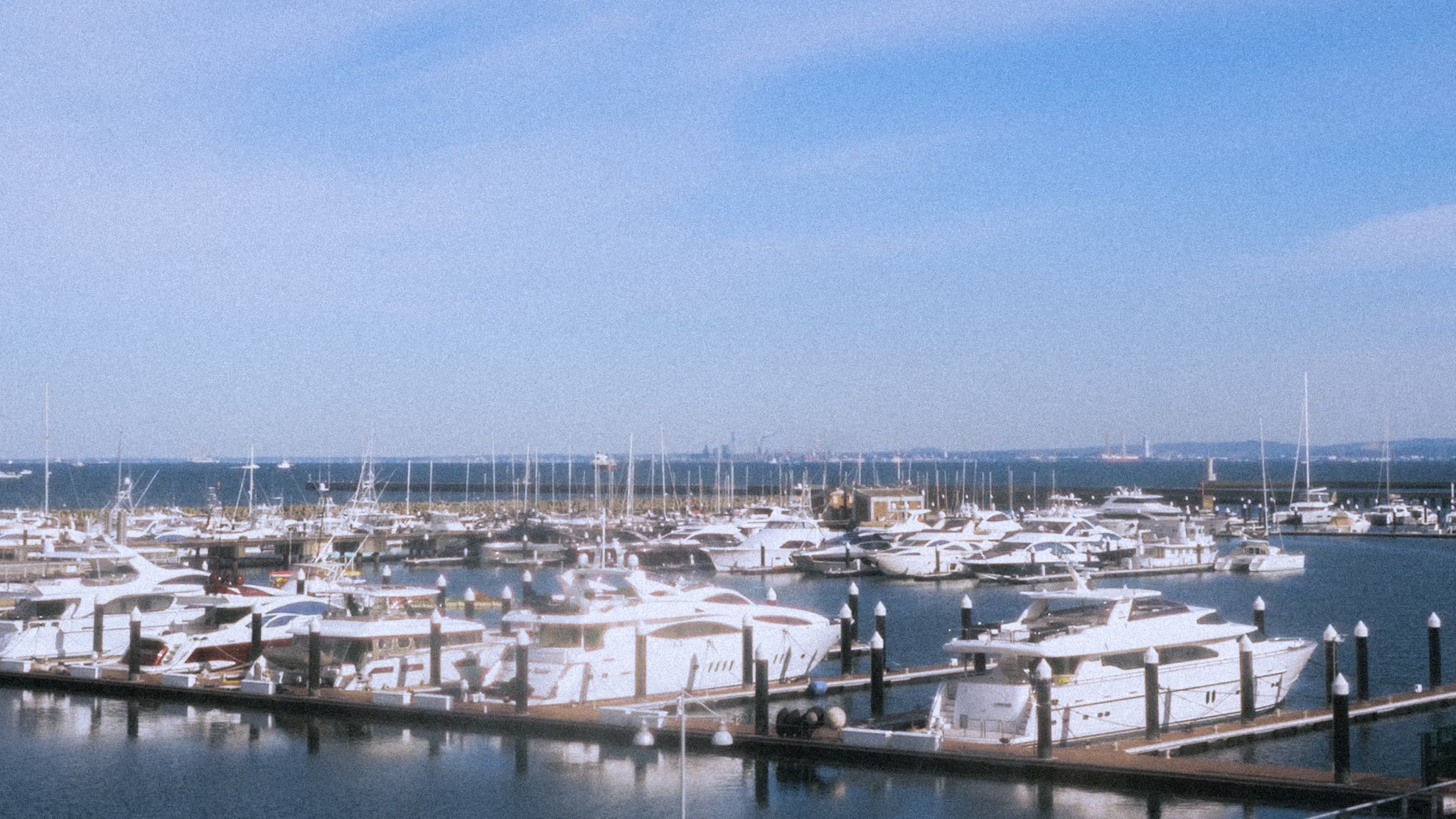
This one is an improvement over preset 1 with a cooler tone—more balanced. I’m okay with this one for now—I’ve tried it on other photos and it works well—though I’m still not satisfied.
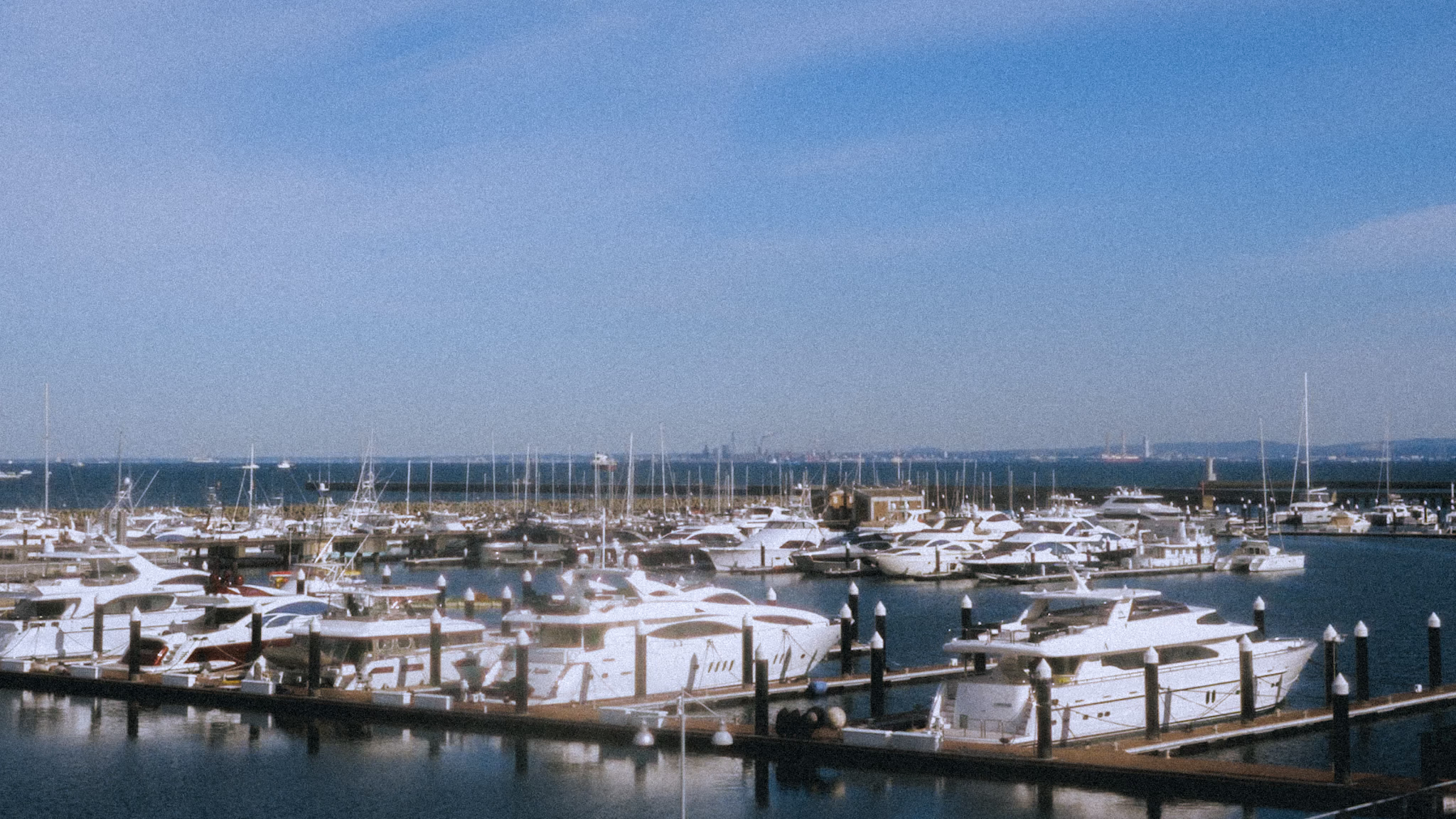
I like the colors on this one—it somehow works with this photo. The problem is it doesn’t quite work with other photos.
It’s kind of ironic using a digital camera but chasing the look of vintage photography. But I never wanted to own a film camera—rather recreate the look instead.
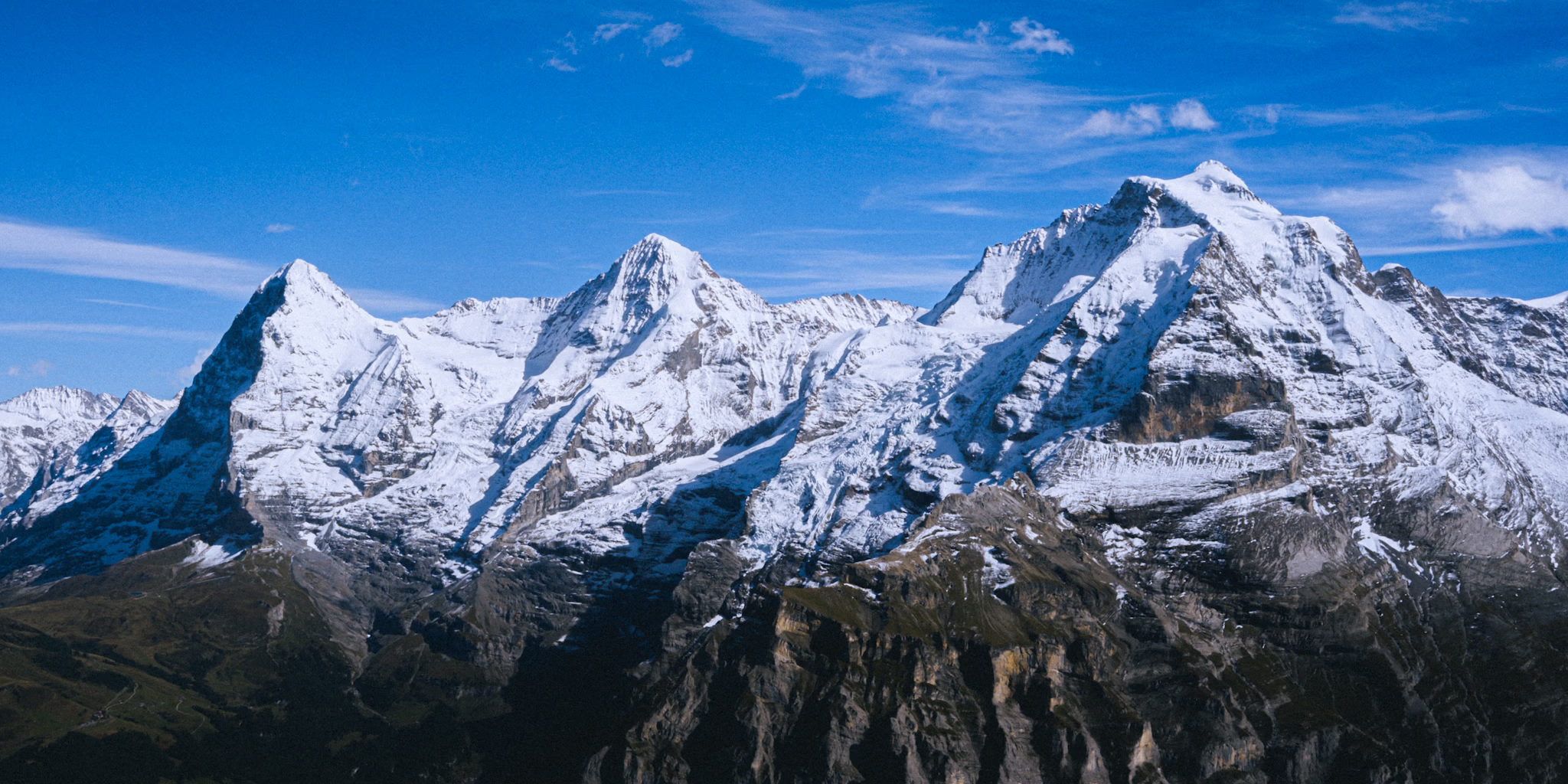
These are Eiger, Mönch, and Jungfrau. I took this shot at Birg right after lunch at Piz Gloria—the rotating restaurant on Schilthorn. I’m grateful to see them in person—though the scene itself didn’t really impress me—or perhaps it was the angle from where I stood. Funny that I found the lore behind them more interesting.
In German, Eiger means ogre, Mönch means monk, and Jungfrau means maiden. The monk stands between the ogre and the maiden to protect her. That’s how they’re positioned geographically—Mönch right between Eiger and Jungfrau.
I only knew Eiger as an outdoor gear brand in my country. Then, the day before I took this shot, I was playing mini golf with friends in Grindelwald and found out the mountain behind the course was Eiger.
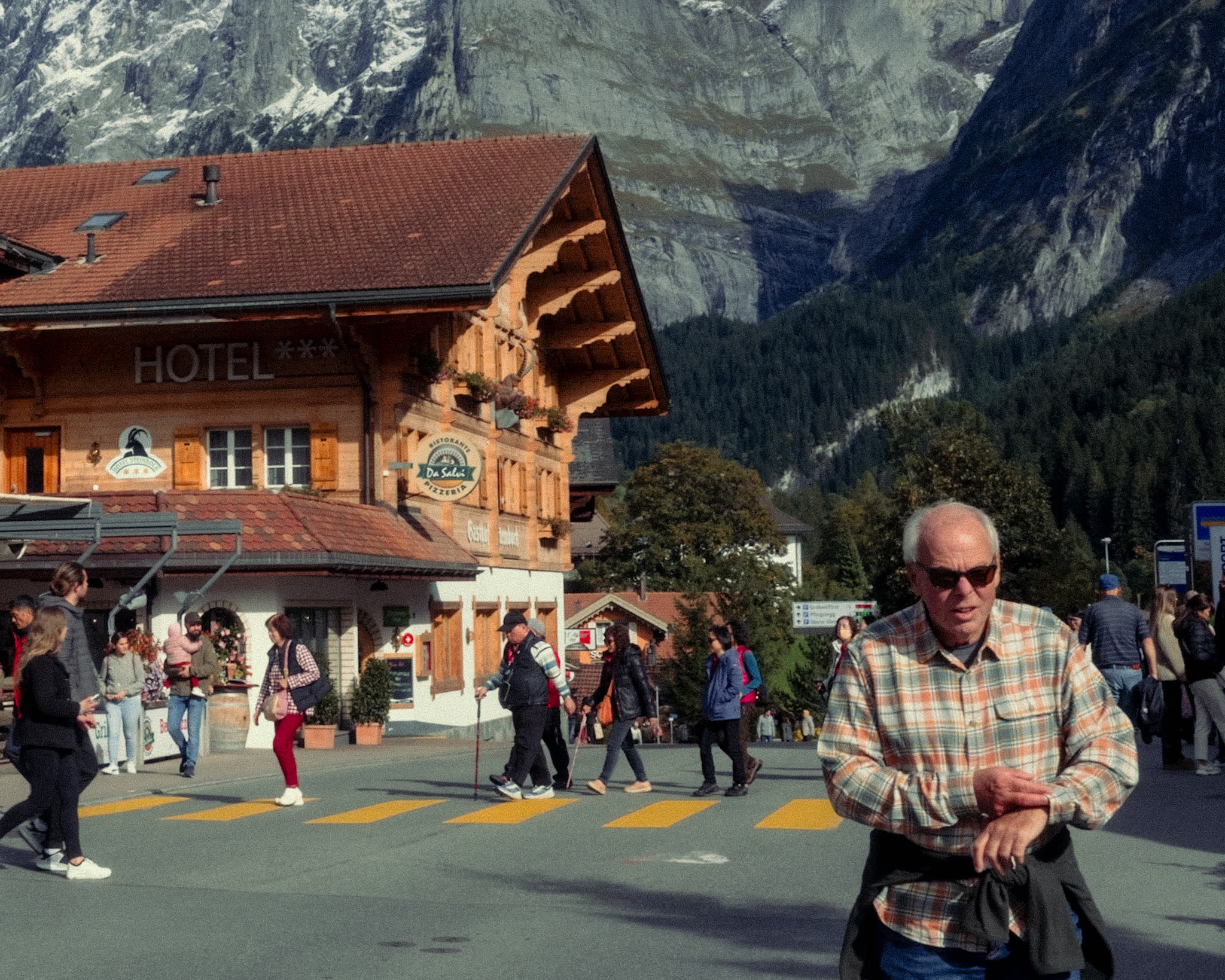
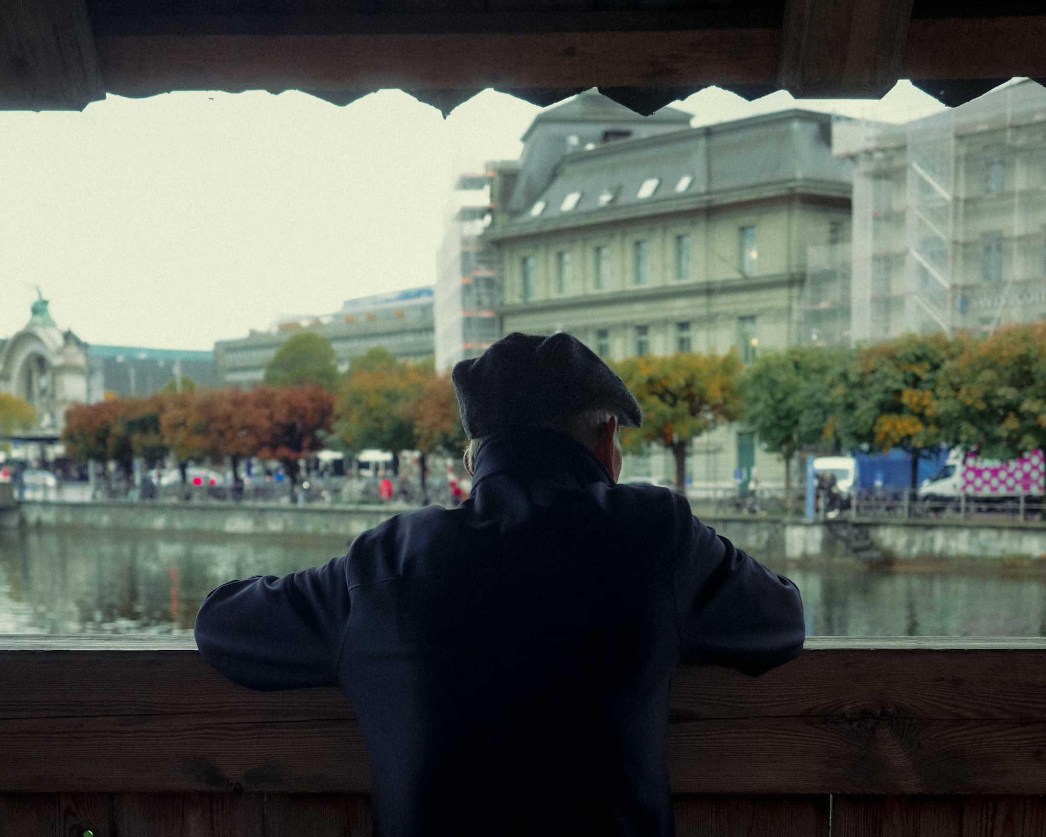
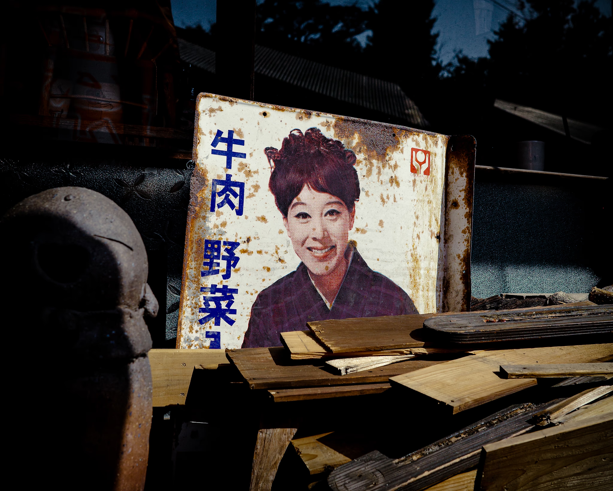
I took this shot a few years ago while walking around a pottery workshop in Tokoname, Aichi. The place was chaotic—scraps and random stuff everywhere—but this old signboard caught my eye. It stood out against the mess around it.
On reflection… something that stands out and catches my eye like this might be often around me—even right in front of me. But I somehow miss it. Perhaps because I’m moving quickly, my mind is elsewhere, or something like that.
What if I slow down a little—giving myself a moment to be present, unhurried, and open? Could I notice things like this more often?
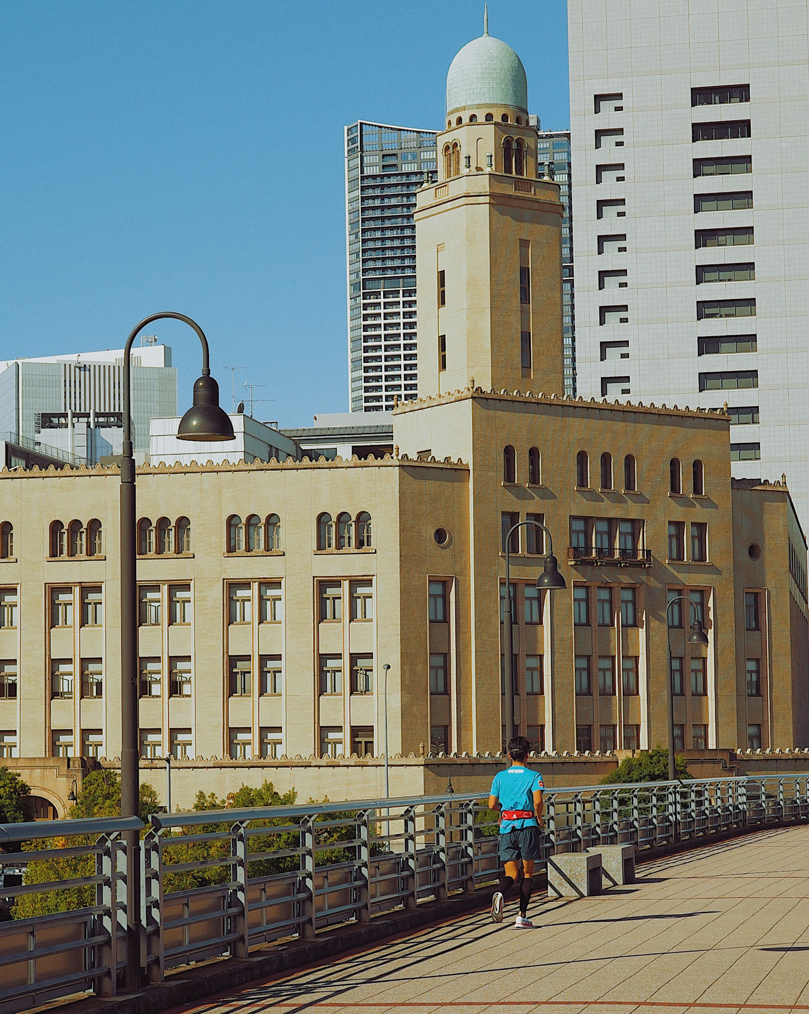
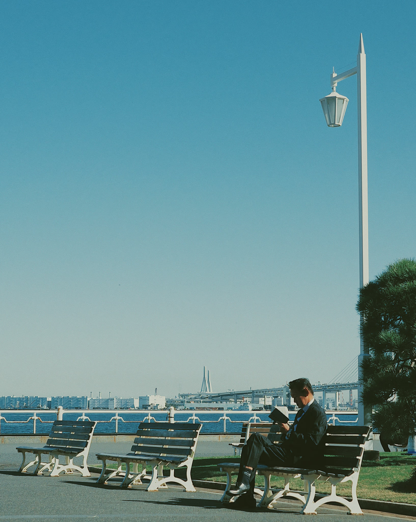
These were my first experimental shots while exploring my visual style. Inspired by the editorial aesthetic of 90s magazines—that soft, matte look often associated with film photography. I’ll call it vintage magazine here.
The main pattern I noticed in the vintage magazine style was low contrast—a matte effect where the shadows don’t go pitch black.
Unlike the typical vintage magazine pattern, I set the sharpness a bit higher here because I found it more appealing.
I’ve also added some grain—big fan of it. It makes the photos feel a bit old, but it fits the look I was going for.
I used VSCO for editing. At the time, I didn’t want to spend too much time on complex color grading.