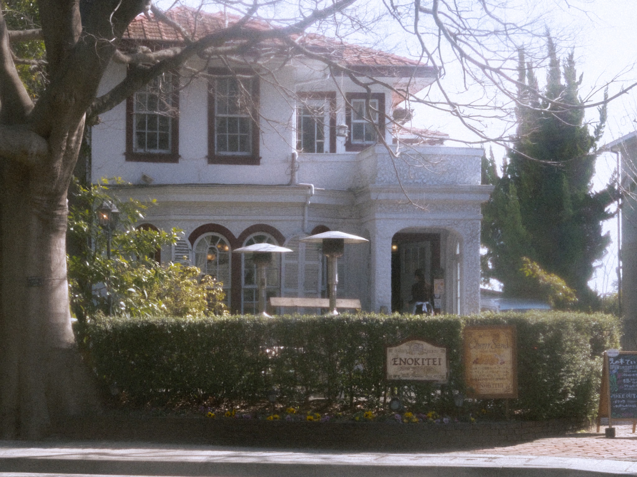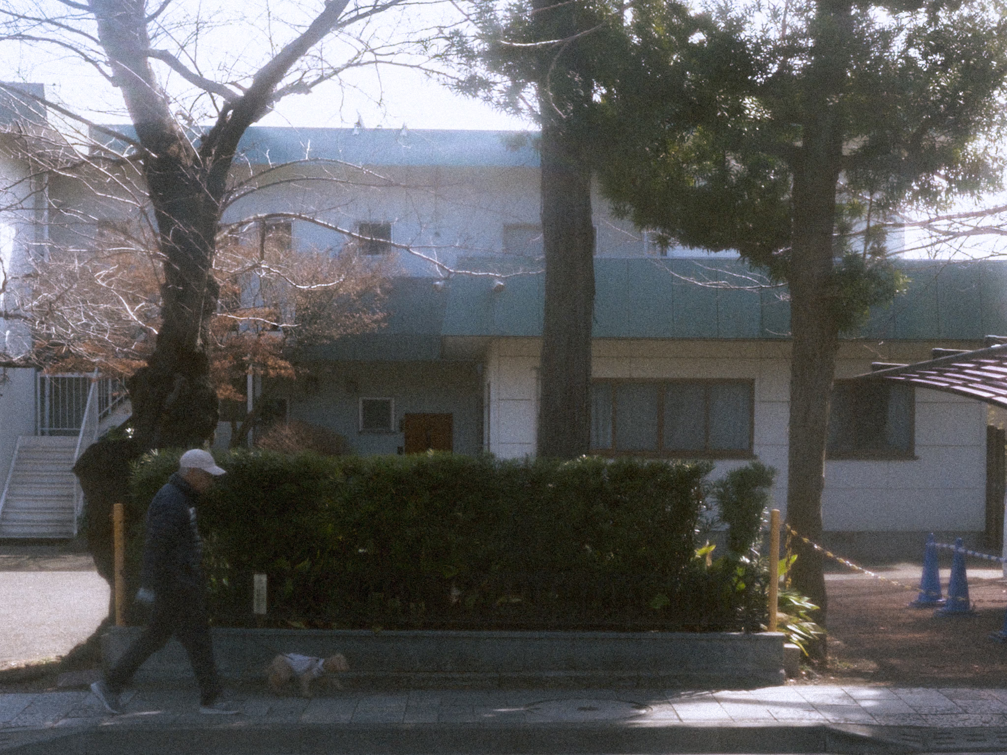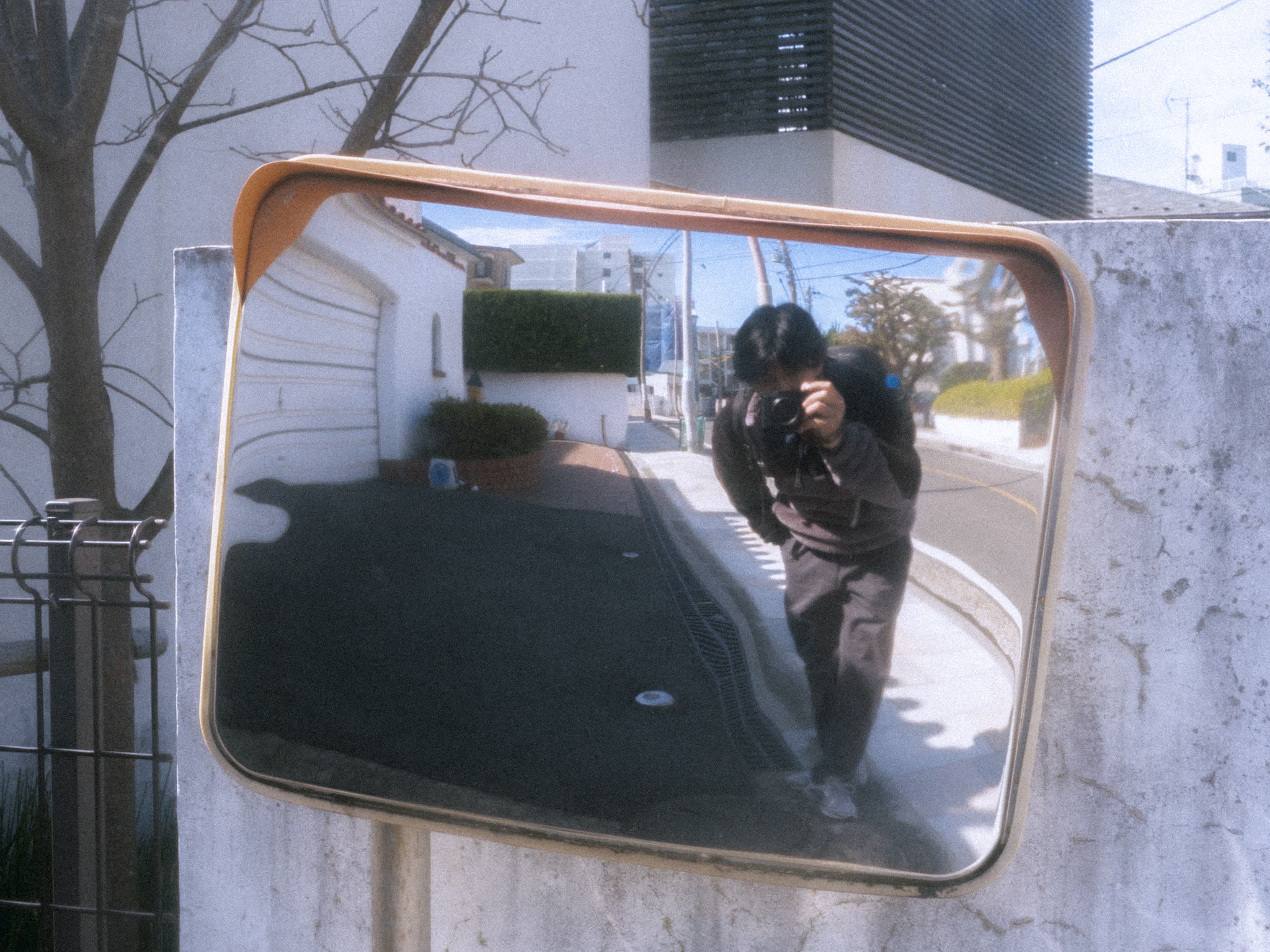

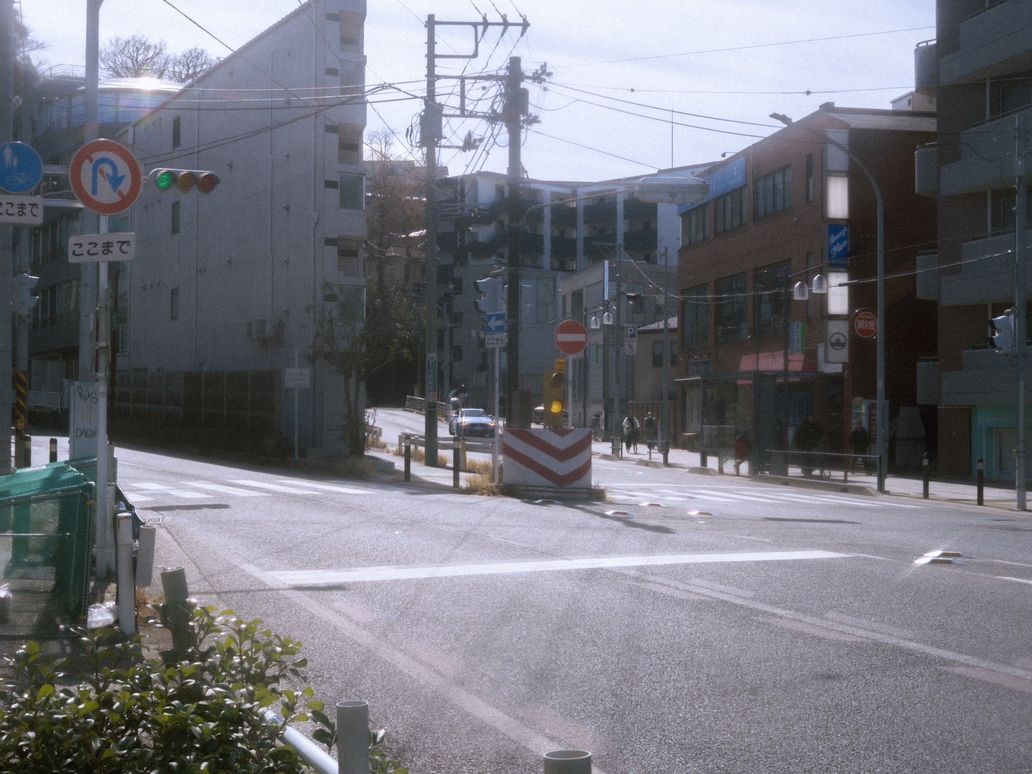
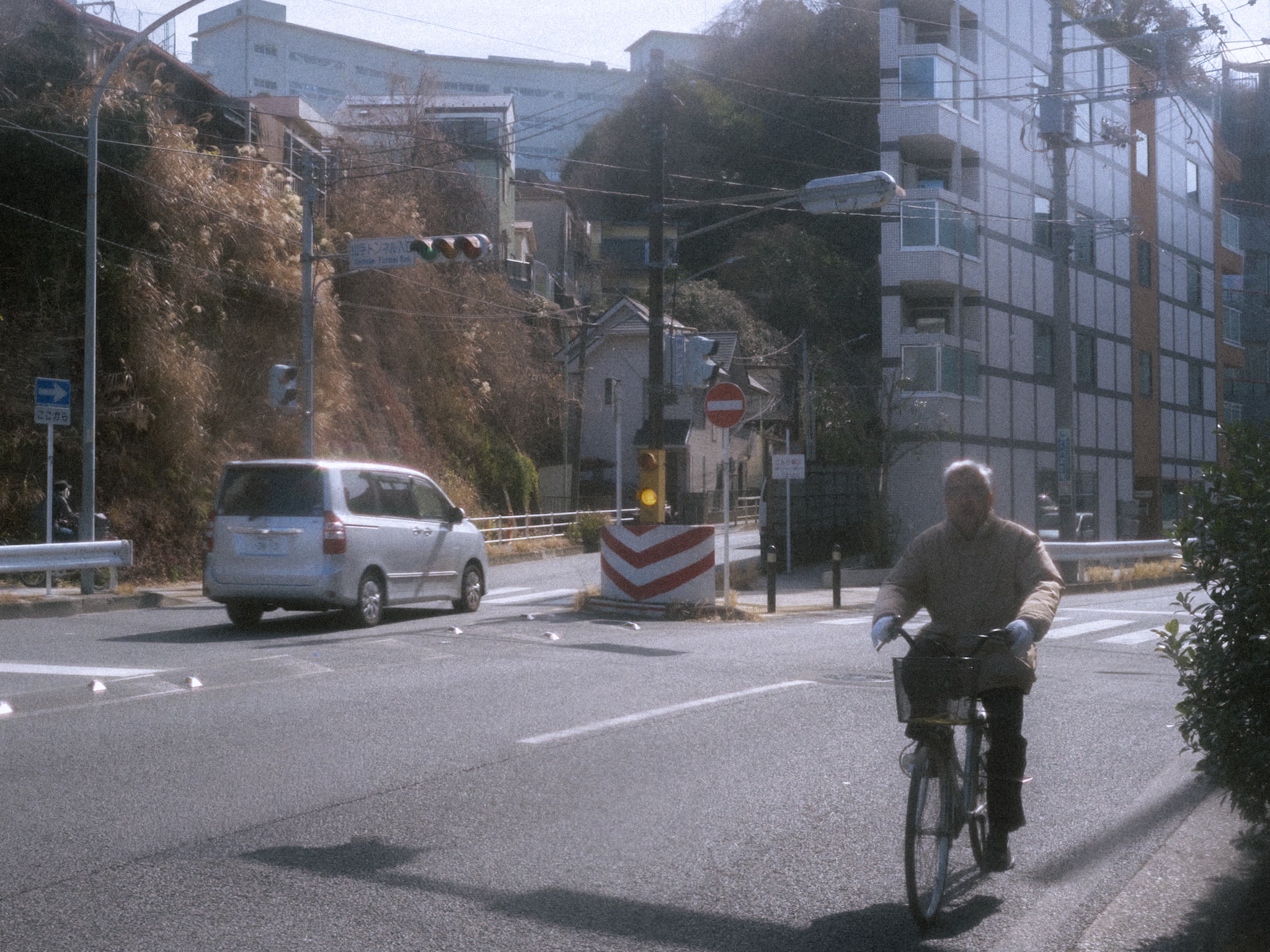
These places aren’t landmarks—not even spots people would photograph. But I visit them every time I’m in Yokohama. I discovered them through two beautiful songs I heard in middle school—songs with music videos set in these exact places.
I remember the first time I visited—I put on my headphones, played both songs, and just stood there for some time—lost in nostalgia until the songs ended. Then I realized I was standing in beautiful places because of those songs—places I once only knew from a screen. I don’t have a word for what this is. People might call it manifestation—something I don’t believe in. Whatever it is… it is—at least to me—sentimental!
Now, every time I visit, even without playing the songs, I still find myself standing there and letting the memories find their way back.
It’s always sentimental Yamatecho.
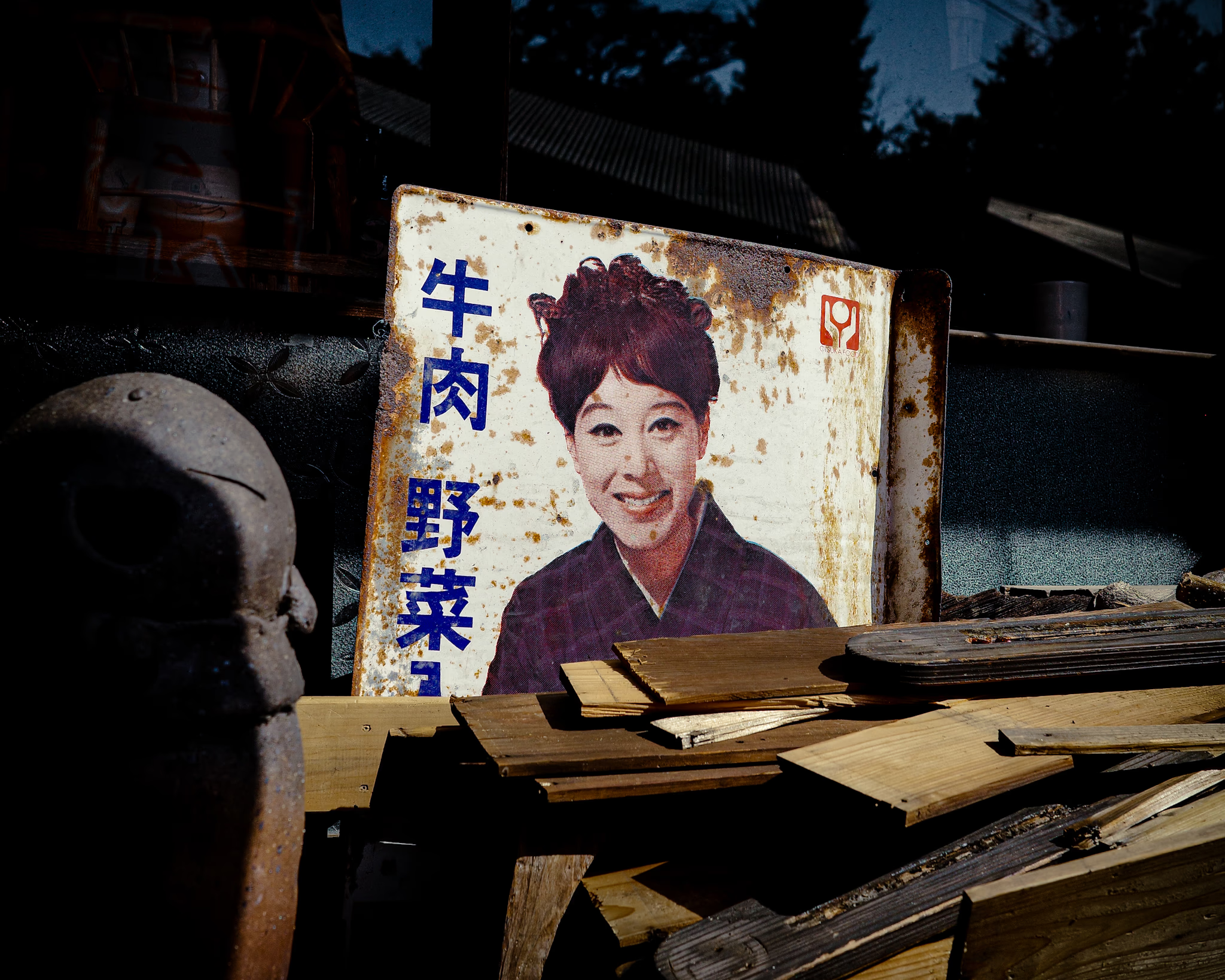
I took this shot a few years ago while walking around a pottery workshop in Tokoname, Aichi. The place was chaotic—scraps and random stuff everywhere—but this old signboard caught my eye. It stood out against the mess around it.
On reflection… something that stands out and catches my eye like this might be often around me—even right in front of me. But I somehow miss it. Perhaps because I’m moving quickly, my mind is elsewhere, or something like that.
What if I slow down a little—giving myself a moment to be present, unhurried, and open? Could I notice things like this more often?
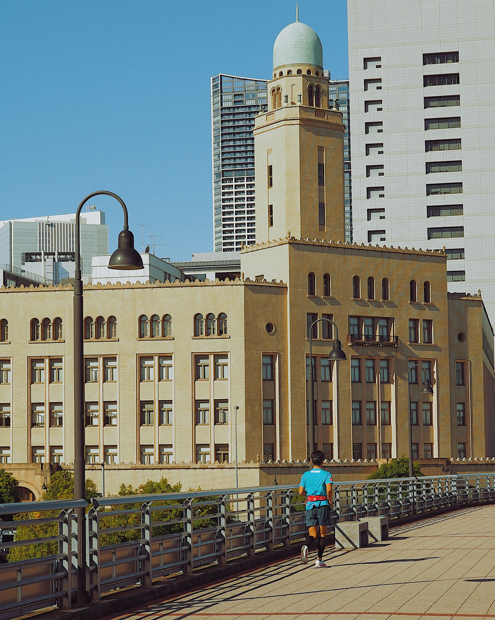
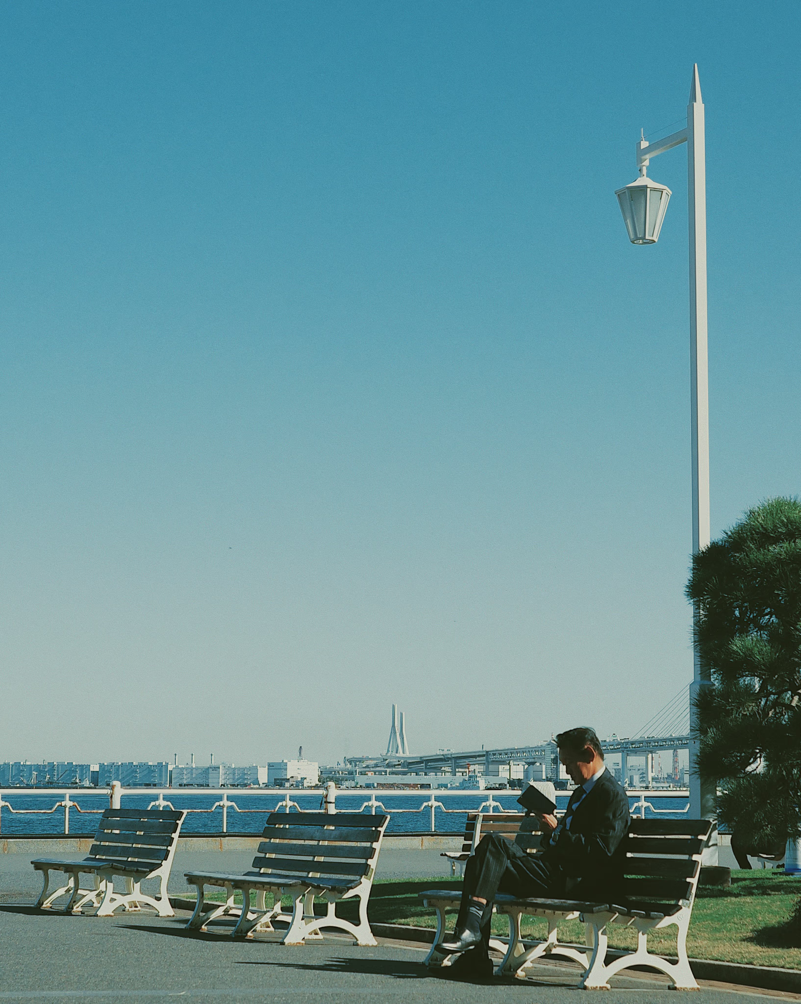
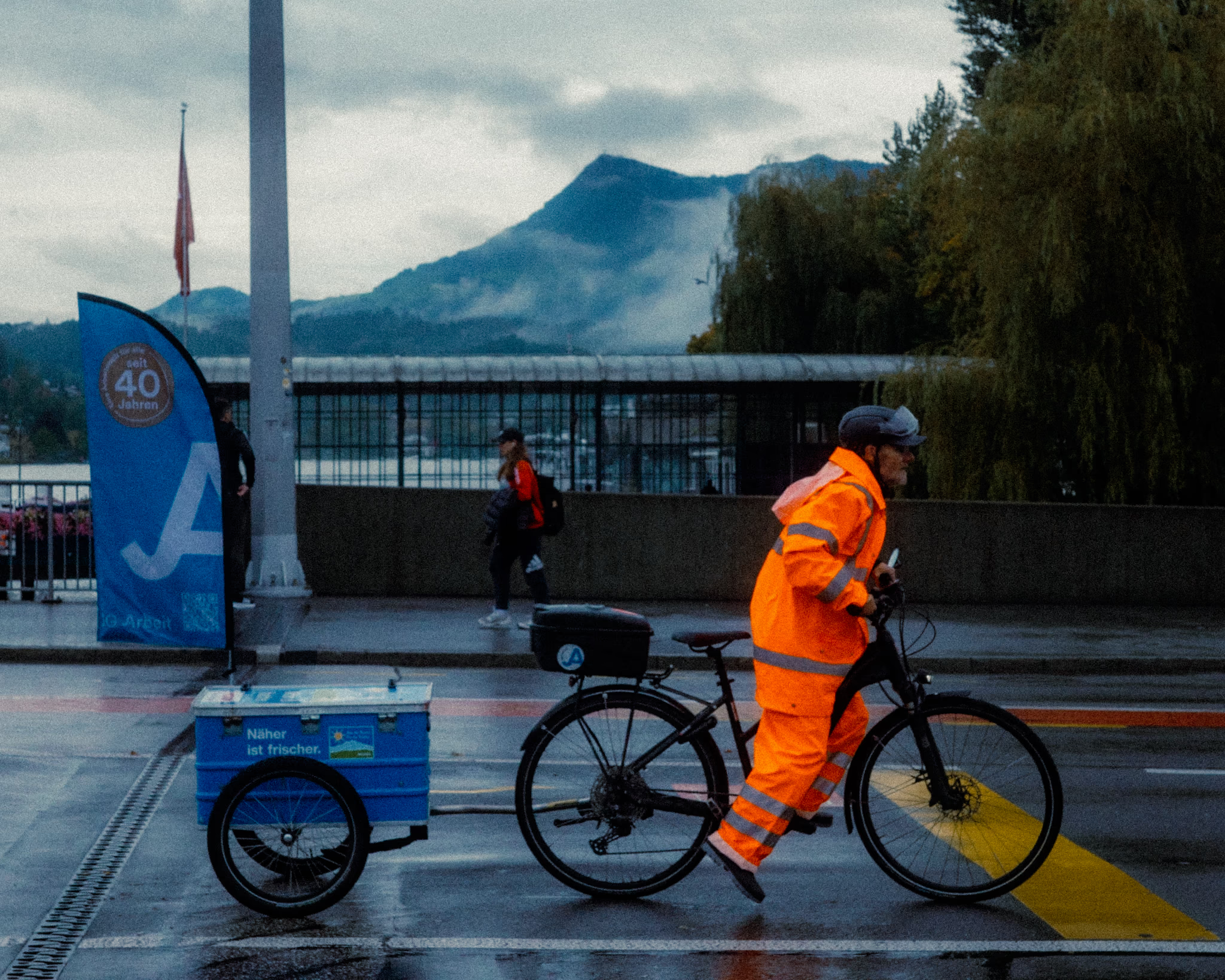
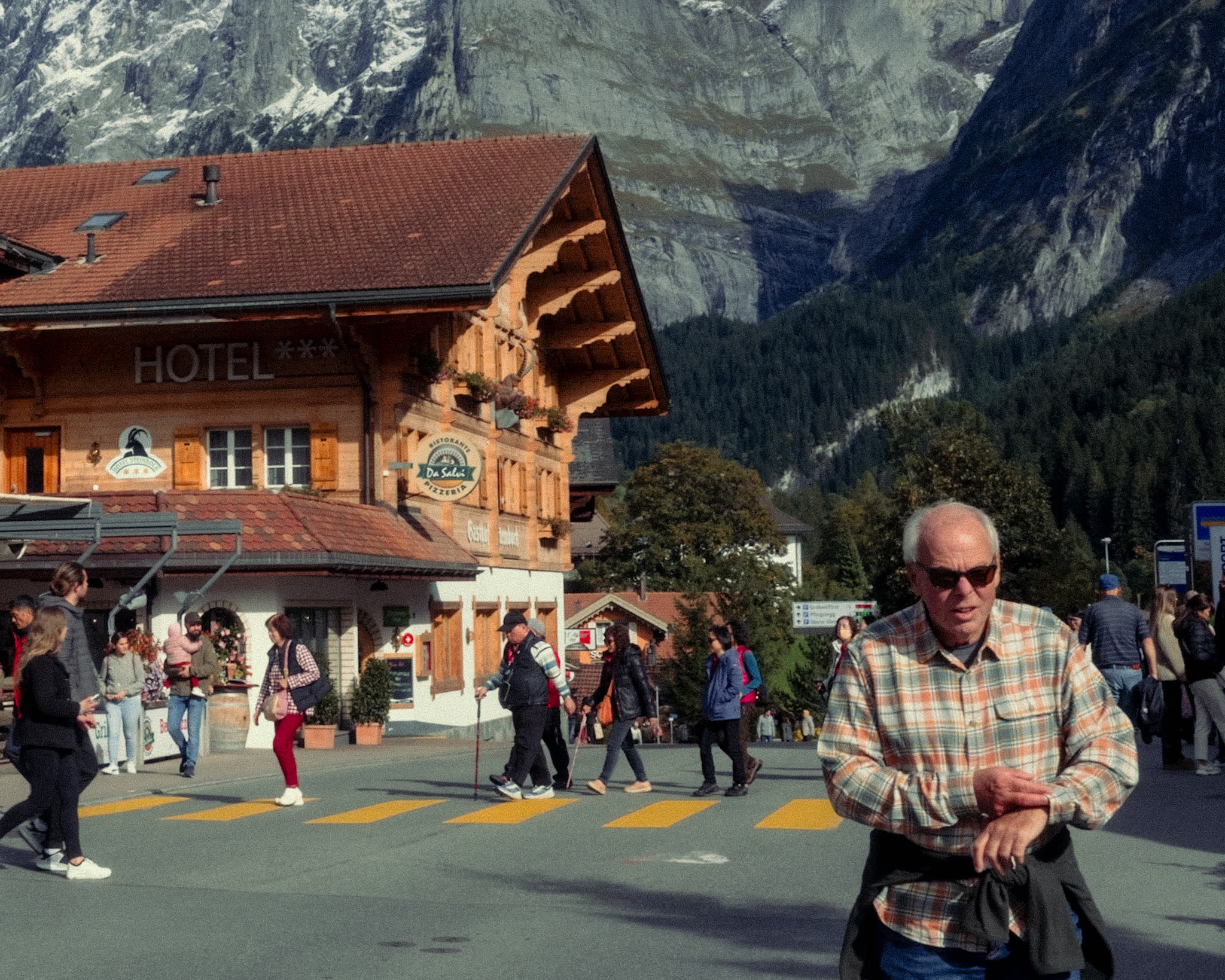
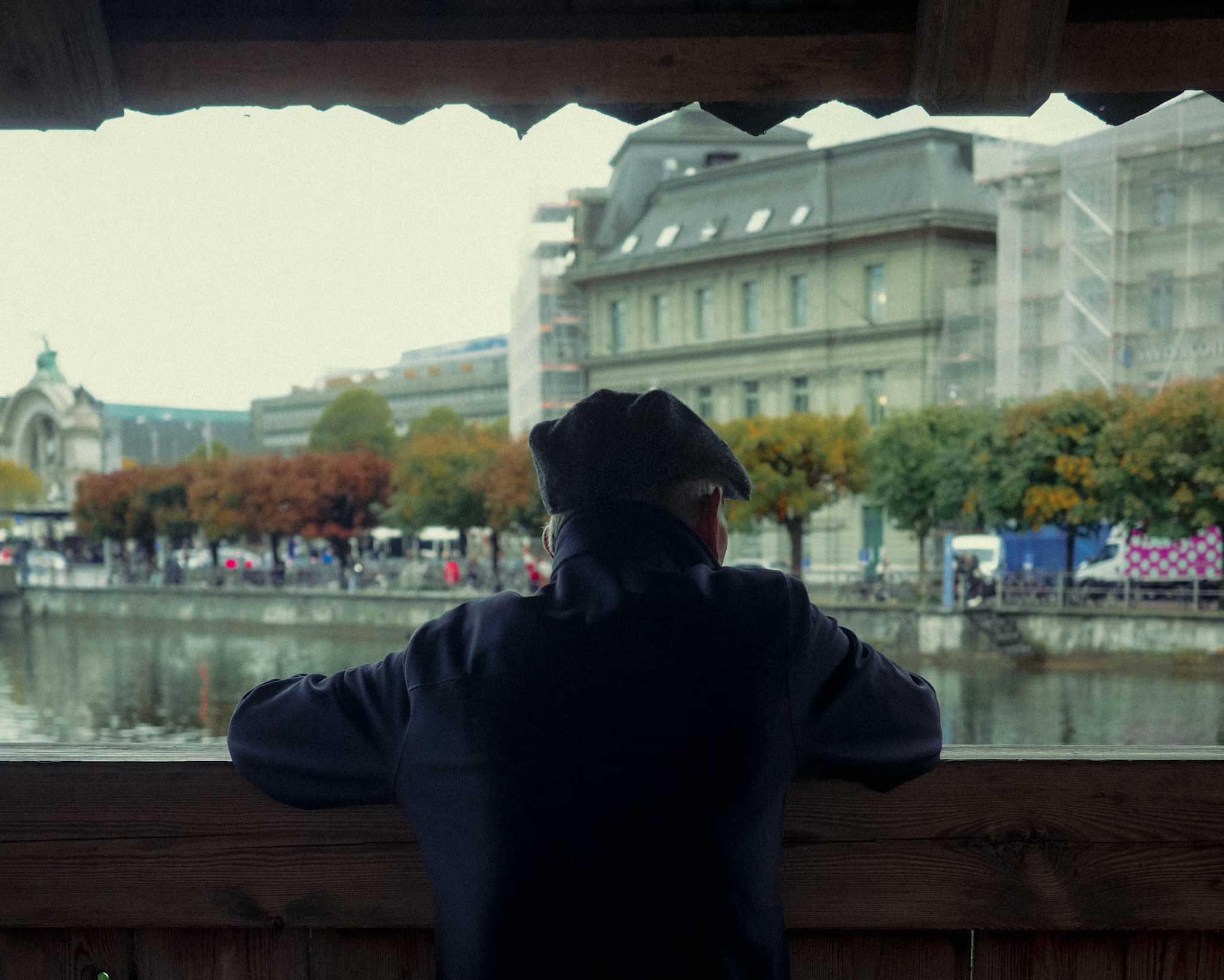
These were my first experimental shots while exploring my visual style. Inspired by the editorial aesthetic of 90s magazines—that soft, matte look often associated with film photography. I’ll call it vintage magazine here.
The main pattern I noticed in the vintage magazine style was low contrast—a matte effect where the shadows don’t go pitch black.
Unlike the typical vintage magazine pattern, I set the sharpness a bit higher here because I found it more appealing.
I’ve also added some grain—big fan of it. It makes the photos feel a bit old, but it fits the look I was going for.
I used VSCO for editing. At the time, I didn’t want to spend too much time on complex color grading.