
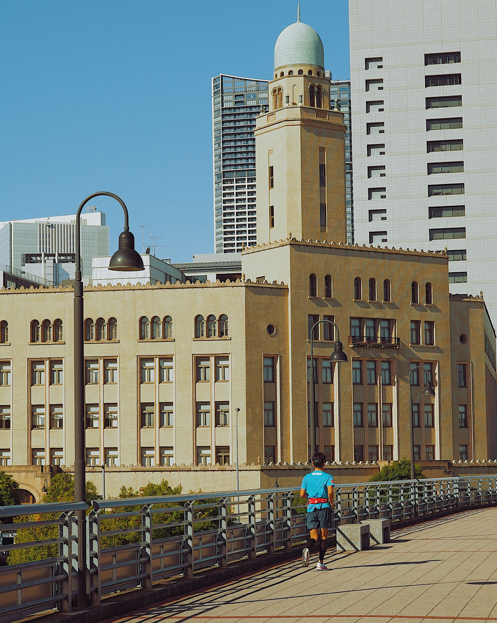

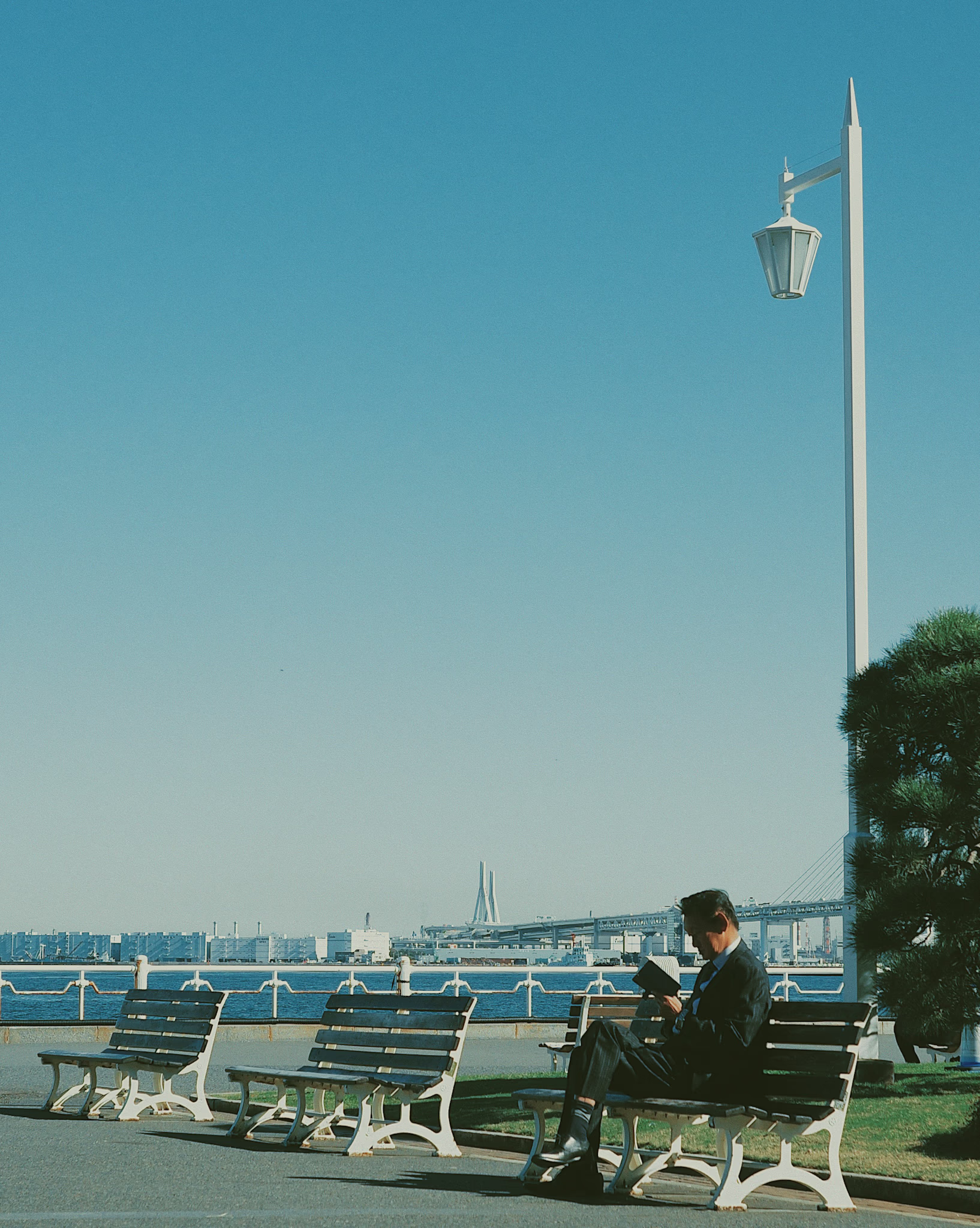
These were my first experimental shots while exploring my visual style. Inspired by the editorial aesthetic of 90s magazines—that soft, matte look often associated with film photography. I’ll call it vintage magazine here.
The main pattern I noticed in the vintage magazine style was low contrast—a matte effect where the shadows don’t go pitch black.
Unlike the typical vintage magazine pattern, I set the sharpness a bit higher here because I found it more appealing.
I’ve also added some grain—big fan of it. It makes the photos feel a bit old, but it fits the look I was going for.
I used VSCO for editing. At the time, I didn’t want to spend too much time on complex color grading.